
Print Status (Work in progress)
NYU’s global printer map allows students to print from any printer in NYU’s network around the world
My Role
Throughout this project, I contributed to user testing, UI design iteration, and prototyping. Moreover, I worked as a design supervisor to maintain visual consistency by integrating the Torch design system for NYU IT’s branding.
Tool
Figma, Zeplin
Team
Sarth Desai (Product owner), Yurou Zhang (UX designer), Abhliash Kulkarni (Front-end developer), Hitesh Paul (Back-end developer)
Process Overview
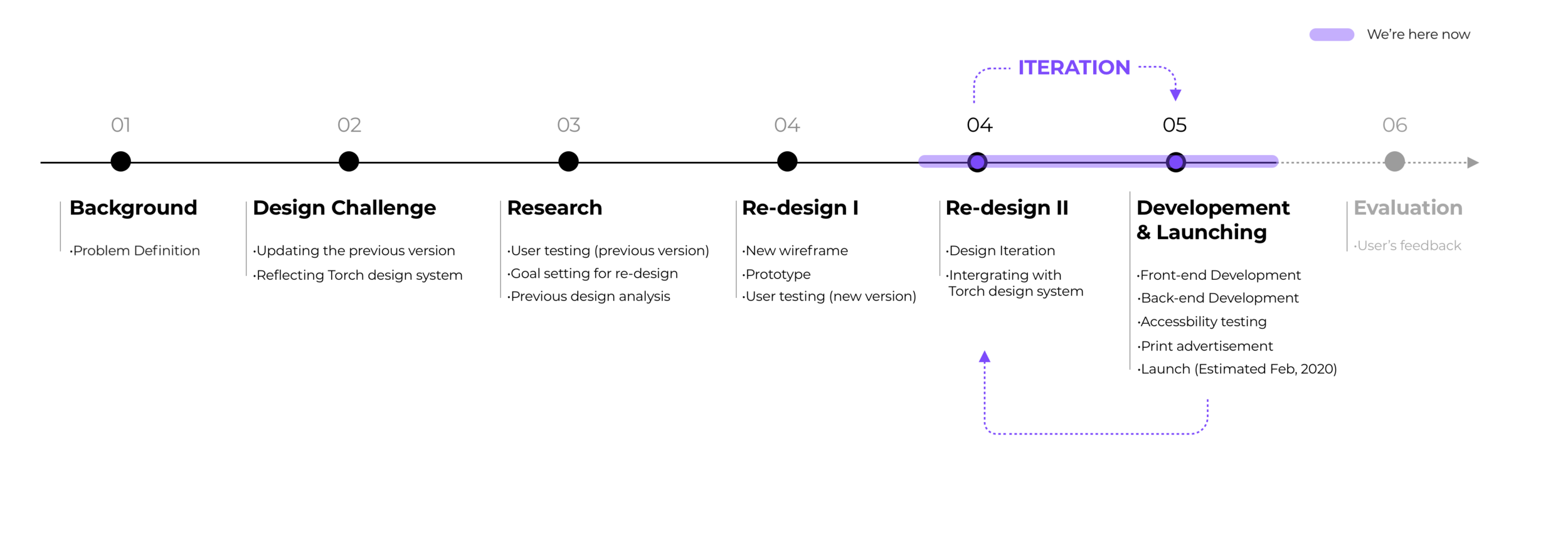
01
BACKGROUND
“Where is the closest building that I can print my homework?”
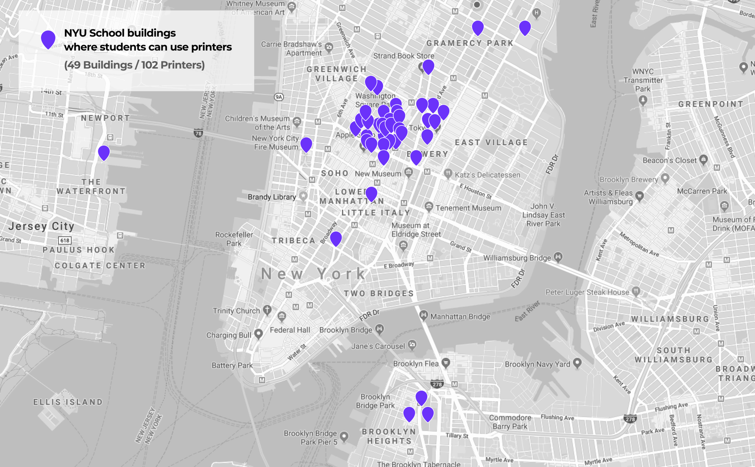
New York University is a global university that is spread across the globe. Specifically in New York, NYU owns many buildings. A lot of the times, students don’t know that a certain building belongs to NYU.
As part of the NYU community, students, faculty, and staff can use printers that are in NYU buildings. However, previously NYU did not have an integrated platform to track where the printers were. Most of the students only know about the printers located in the NYU Bobst Library. It was a problem that NYU students did not know where they could go to print.
02
DESIGN CHALLENGE
Redesigning (Needs to be updated from previous version)
The 'Print status' development had been halted for a while due to reorganization and team member's transfer. Therefore, our team has been organized to work on this product to the successful launching. Firstly, we mapped out the previous design’s user flow in order to conduct user testing and analyze it.
Implementing Torch Design System for a new version
Since I have been leading the Torch Design system (NYU IT Design system), I needed to test out the Torch Design system’s implementation to this project as a first trial of NYU IT’s digital products. Ultimately, we changed most of the UI design parts from previous version and we discovered several points to be updated or added to the Torch design system.

I have been leading the Torch Design System (NYU IT Design system). This design system will apply for all the digital products at NYU IT.
torch design system
Click the image to learn more
03
RESEARCH
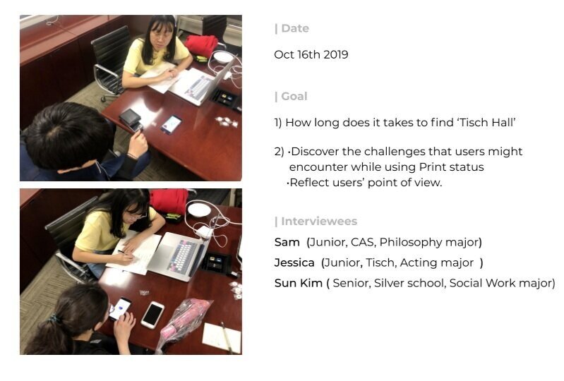
USABILITY TESTING
“It’s a bit complicated to quickly scan the printer’s availability”
Before diving into analyzing previous design by ourselves, we conducted usability testing with the target audience (three of NYU students) to observe our user’s behavior. To our expectations, users encountered many issues with conflicted and ambiguous UI elements. This usability testing brought us to specify our primary goals for the redesign phase.

| Key takeaway
Clear visual hierarchy for delivering information is crucial.
( Printer’s status and their location)
New user experience with enhanced user flow.
Coherent visual theme is needed.
( Applying Torch Design system)
| Existing design analysis
Based on the user's feedback and our observations, we started into analyzing the previous design. Furthermore, we tried to figure out to optimize both user flow and implement the Torch design system. We marked the components to be changed by using red marker for UI elements and module, orange marker for micro components, green marker for user flow.


| What we discovered from existing design analysis?


04
REDESIGN
PHASE 1
Creating new wireframe for better user flow
Since the previous version missed the city selection, we needed to add an additional layer which permits users to select up to three locations to find the nearest building from their current location ( Cities > Campus locations > Buildings). Therefore we reshaped the wireframe to make the selection process more seamless.

PHASE 2
Quick prototype & Second usability testing
Before polishing UI elements, we decided to conduct a second usability test for new user flow and design to discover blind spots that we might have missed. By using Figma mirror application, we conducted usability testing with three different NYU students from different departments. Therefore, We were able to receive valuable feedbacks which we had not considered for the new version.


| Key Takeaway
Our users mainly encountered issues with content, instruction & labels.
1) More understandable labels are needed to deliver information.
2) A functional, text-based ‘Help guide’ is needed rather than illustration.
PHASE 3
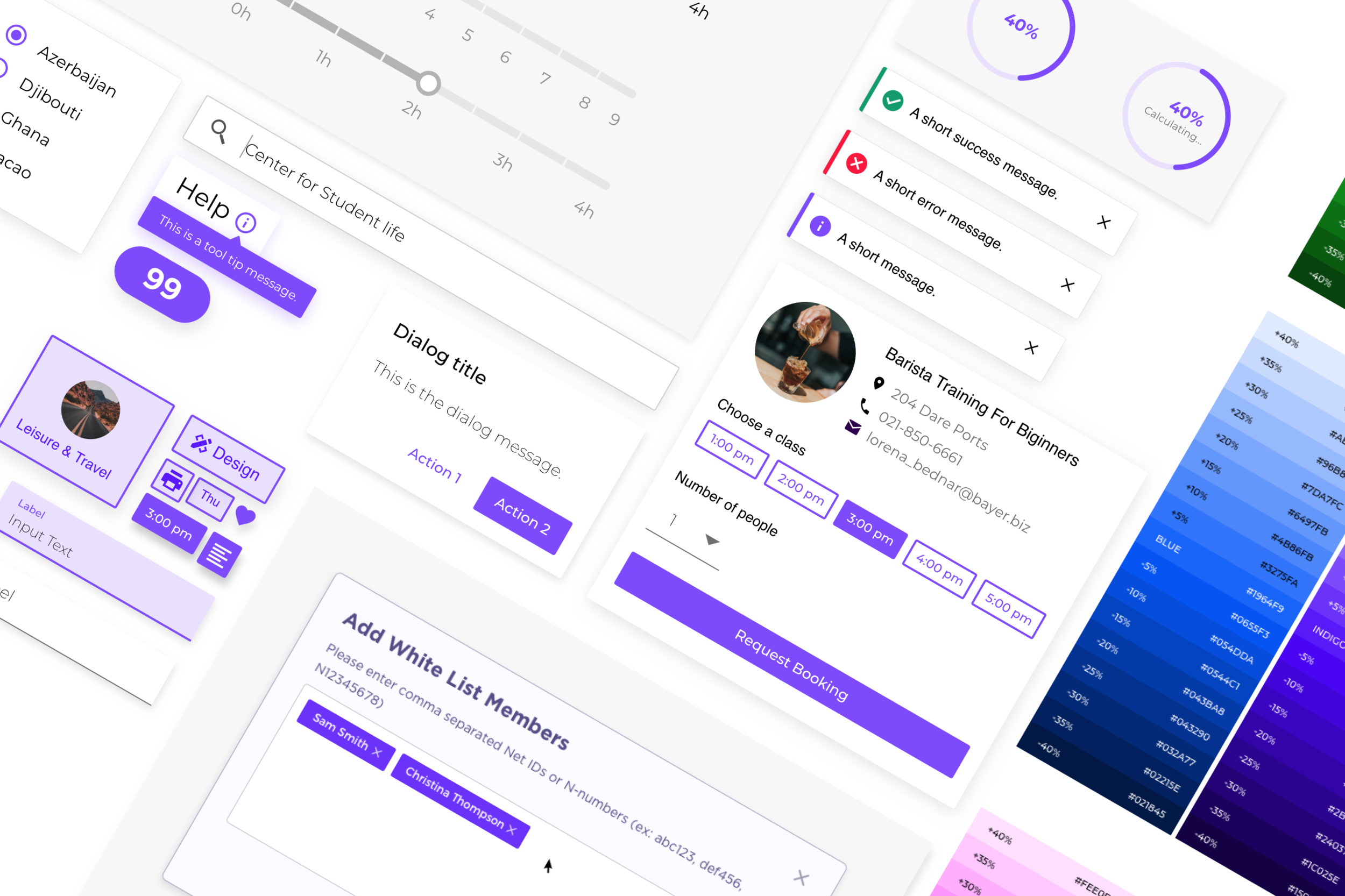
| New visual theme (Implementing the Torch design system)
There were two of my main tasks to work on UI design:
Design with clear information hierarchy which allows users to navigate printers quickly and easily.
Observe and test out how the Torch Design System works with real products and what are the limitations that might need to be developed for next version of design system.

PHASE 4
New UI design - What has been changed from the previous version?
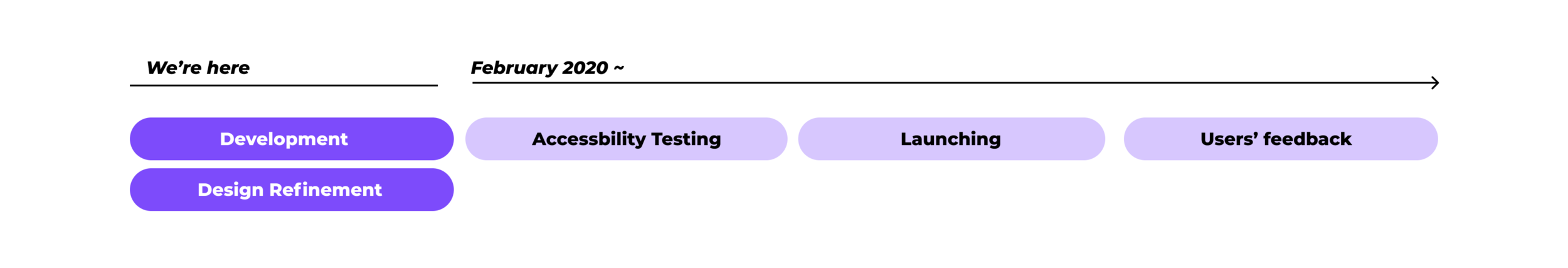
Work in development ( Will be Launched by March, 2020)
| Landing page

| Browsing printer’s location
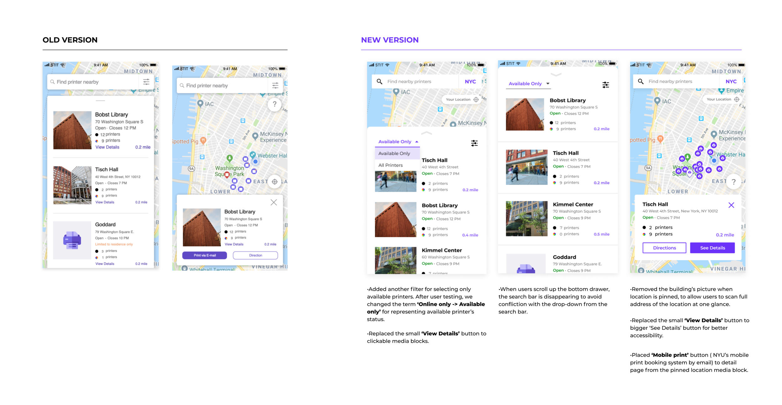
| Detail page

| Help guide
• Instead of using illustrations with general instruction, we placed the screen capture to deliver more detailed instruction.

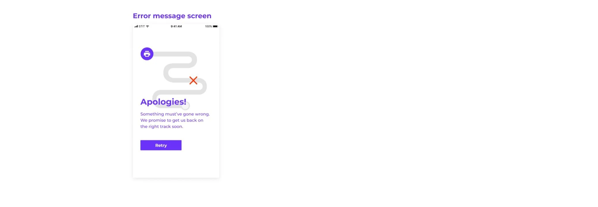
| Error message screen
• Added error message screen in case the printer’s API is not working.
What’s next?
05
REFLECTION
The challenge for working with two types of API
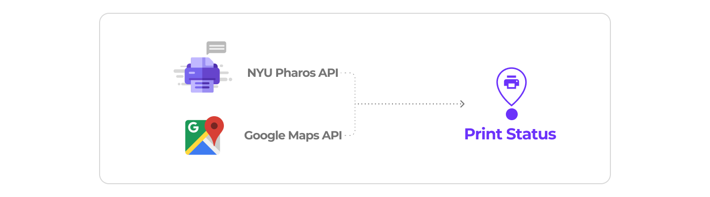
As a designer on this project, I was able to learn more about how the API works from the back-end side and how it can affect UX/UI design. Receiving the correct data from the exact printer's locations was the biggest challenge. Because the input data name varied depending on who has managed it, that created a lot of weird grouping for UI design elements. This resulted in spending a long time trying to figure out this problem with engineers.

We faced weird results due to wrong API management. Because some floor has multiple printers, but the printers’ locations were not correct. As a result, when we used the Pharos API, it made an annoying screen like the left image. Accordingly, our back-end developer had to figure it out it manually.
APPENDIX
ITERATION
How we’ve got the final design decisions
We mainly focused on these four criteria ;
1) Clear visual hierarchy 2) Instant understandability 3) Accessibility 4) Visual consistency.


BRANDING
Print advertising design for NYU school bus
In order to inform this print status’ launching for students, we designed posters which will be attached in NYU’s school buildings and school buses.
We designed the posters to be simple with a bold typography.

Design by Yurou Zhang