
Talking Pole (Mobile Application Ux Design)
Medical I.o.T product design & Mobile Application design
Overview
This is a mobile application design to support the ‘Talking Pole’ project - a smart IV pole which assists patients' needs and anxiety during their hospitalization.
Role
After our team was selected for a year-long funding project by Samsung Electronics, I personally developed and explored more about UX/UI design part.
Team
Solo redesign project based on Talking Pole I.o.T Project
Team for Talking Pole I.o.T product design
Software Engineers, Hardware Engineers, Bio Medical Engineers, Emergency Room Doctor, I.o.T Product manager, Technical legal expert)
Tool
Sketch, Illustrator, Principle, Overflow, Xcode
Background History
‘From Samsung Hackathon project to beta version showcasing’
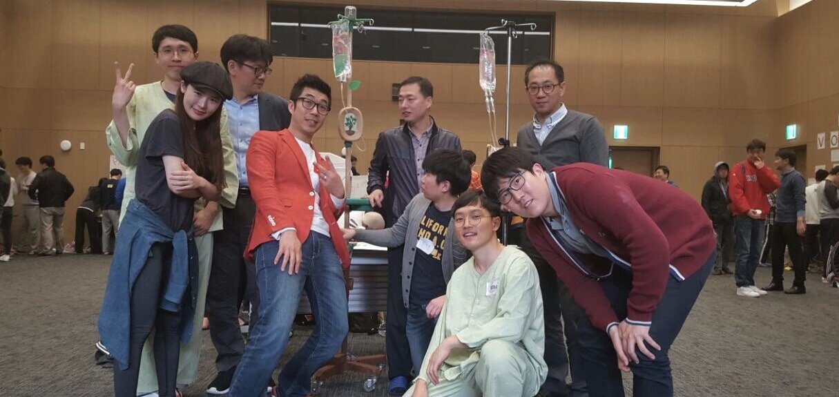
2016, I participated in In-house Samsung Hackathon which held by Samsung Electronics. As an experience designer from Samsung advertising company, I worked with experts from all different Samsung affiliates. Eventually, this Hackathon project became my life-changing event which makes me determined to study Human-computer Interaction and Emerging Technology.
2016 Hackathon by Samsung Electronics
It was great experience to work with top experts from different departments of Samsung - Software Engineers, Hardware Engineers, Bio Medical Engineers, Emergency room doctor, I.o.T Product manager, Technical legal expert.
Selected by Samsung Creative Lab
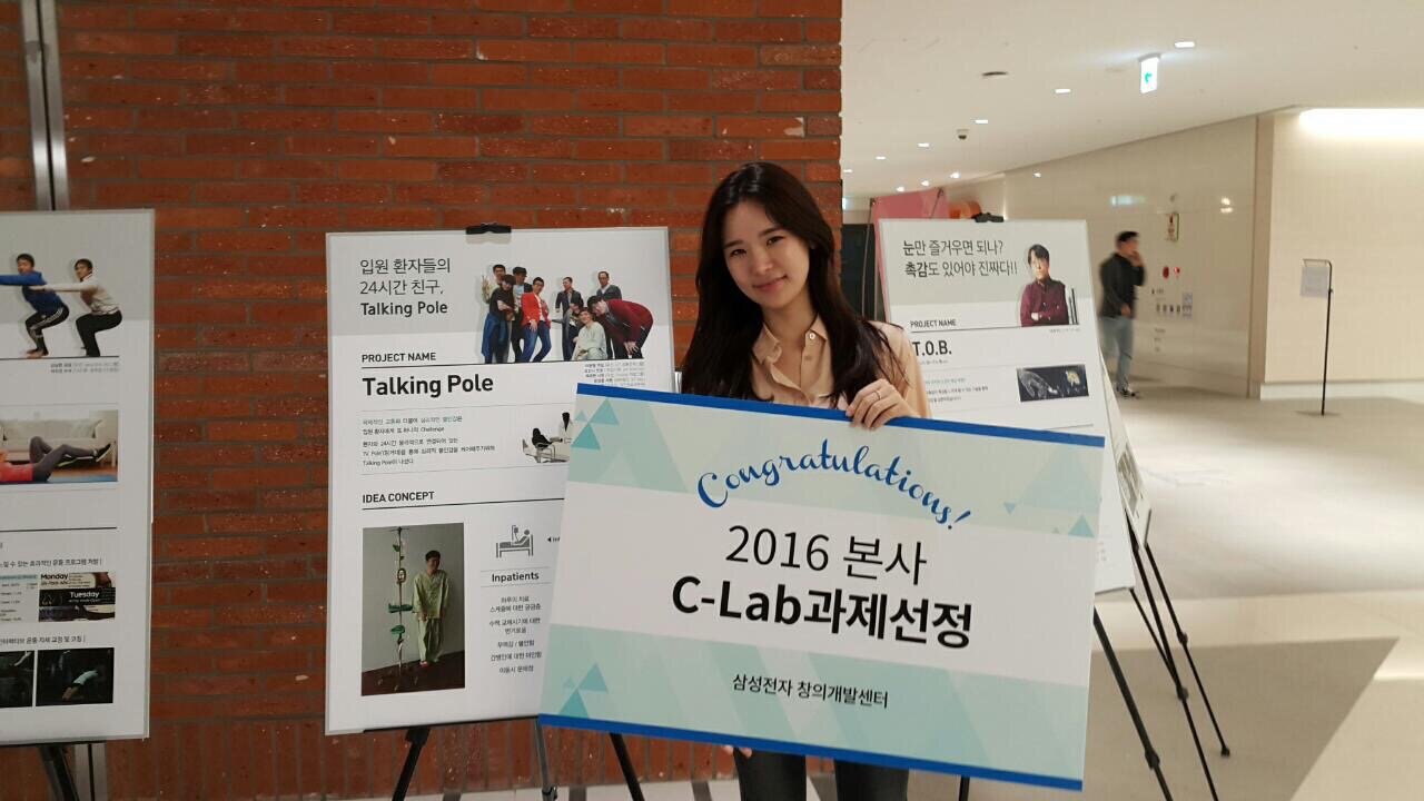
‘Talking Pole’ was selected as one of Samsung Creative Lab's projects which was a year-long funding project by Samsung Electronics.
2017 Showcasing
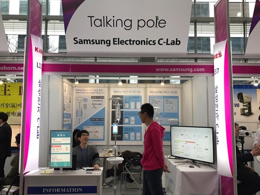
A year later, Talking pole had been developed for its’ beta version and had a showcasing at Korea International Medical & Hospital Equipment Show.
Quick prototyping overview
(From Hackathon)


Design opportunity
Existing UX design
Due to commercial/technical issues between Samsung’s affiliates, I was not able to move to Samsung’s creative lab to finish this project. For this reason, official UX design works were taken over by other UX designers. Since I was the designer who had developed the idea from scratch and was selected as the creative lab’s project, it motivated me to re-design it with my perspective even though it was not going to be officially reflected in the final design.


Re-design process

Goal setting
Talking pole Ux design has two parts: the patient’s side and the medical staff’s side. Given that I lacked resources for research, usability testing and iteration from the Samsung hospital, I focused on the re-design of mobile application from the patients’ side.

Defining target audience
According to a medical journal, a patient’s average hospitalization period was 8 days (minimum 5 days to maximum 16 days, depends on types of disease, Korean hospitalization standard). Therefore, I needed to think about a week base ux design.
Interview
‘Apart from physical pain, psychological distress is another big challenge for inpatients’
While preparing for a presentation of the Talking pole project to Samsung Creative lab, grabbed patient’s insight by interviewing 3 people who had experienced a hospitalization at least one week.

Mind map
To more deeply empathize with the inpatient experience, I mapped out this mind map based on the interviews.
While making the mind map, I discovered easy access to communication and information is crucial to alleviate patient's anxiety. The hospital can be a nerve-wracking and painful experience for patients due to an unwelcoming environment. The cold air, sanitized smell, and white walls can be very intimidating during a hospital stay.

For understanding pain points based on timeline
Existing user journey map
To get more specific about patient’s needs, I followed the process of their hospitalization and mapped out the user journey. This helped me empathize with the problems that patients may encounter and visualize opportunities where I can develop solutions.

Key finding 1
Top three factors that cause anxiety for patients
Limited Information access and lack of communication make them more insecure.
Patients feel inner conflict when deciding if they should burden medical staff or caregivers due to their irregular symptoms
Hospitals' atmosphere tend to be places that produce feelings of anxiety and despair in patients
Ideation
Link the value of IV pole to patient’s needs
In order to make decisions regarding the features, I had to brainstorm and pair each patient’s stress to the solution that the Talking pole might be capable of.

Prioritization matrix
By using the Ideation map, I surveyed people who had experienced hospitalization. With the results, I mapped out the Prioritization Matrix to find the target area.

Key finding 2
“No AI Chat bot! No Voice Assistant!”
Surprisingly, people have skeptical thoughts about voice assistants when it comes to hospitalization, they often have to share the ward with other patients. Plus, during a hospitalization, inpatients tend to be extremely sensitive, most of the people answered that they do not want to use voice technology which might make them irritated. Furthermore, instead of a chat-bot service, they thought they needed in-person human care when they are in extremely stressful situations. Accordingly, I selected the features as a channel to get information or communication with caregivers rather than focus on the AI chatbot type assistance.
Defining key features
Through the Prioritization Matrix, I set the main key features that are shown on the dashboard.

Defining design principle
Considering the context for the hospital’s connotation and patient’s feelings, I defined a few design principles to approach this project.

Information architecture
Before jumping into the sketch, I created basic structures of Information Architecture.

Sketch (Swipe the slides)
I quickly sketched main features. I tried to make UI elements a bit larger than other apps for inpatients. This stage let me find the wrong layout and UI elements that are not fit to contain certain contents.


Wireframes


Visual Design
While working on visual design, I found that many UI elements of my wireframes didn’t fit certain types of contents. Furthermore, I tried to make less scrolling screens and make the app more simple to use for patient’s usability.
Visual Guide

Main Features


Evaluation (Feedbacks from medical students)
I was curious about medical professionals’ feedback about this project. Hence, I reached out to two graduate students who are studying nursing and medical, and they gave me valuable feedback.

Havard University / Human Developmental and Regenerative Biology
“As a doctor (for the near future) I really like the features that patients can note their questions in advance of doctors’ rounds. This will definitely be helpful to spend more effective time for both patients and doctors when a doctor is doing rounds.”
“Since most hospitals in the U.S. have their own system to track patient’s status, integrating with the existing system has to be reliable. If it’s possible, it will be a great tool for helping patient’s staying”

University of Pennsylvania / Nursing & Healthcare Management
“Even though the hospitalization system is different for each country, an inpatient’s anxiety and physiological stress is a universal problem. Therefore I think this app is very useful for patients during a hospital stay.”
“Precise information from data will be important. If the app says that a nurse will come in 10 mins, but the nurse comes later than 10 mins, it might annoy patients. If it can assist with accurate communication both patients and medical staff sides, it will be great as an additional caregiver for patients.”
Reflection (Difficulties)
1) Limited Resources
The biggest challenges were the limited resources for user interviews and the access to the hospital system. If I were in Seoul, I would be able to access Samsung’s hospital in order to conduct in-depth research. However, I worked on this project since I moved to New York to study human-computer interaction, I had limited resources to get in-depth research. On top of that, it was not easy to find interviewees who have experience in hospitalization. Hence, I relied on the research done by my previous teamwork. Eventually, I was able to realize that even though my motivation was just re-design, it’s almost impossible to cover it by myself, especially when it comes to the healthcare category.
2) Differences for hospitalization system between Korean vs Others
As I mentioned, this project is from my previous team project. I developed it based on the Korean hospitalization system. I have thought about starting this project from scratch based on NYU Langone Hospital (since I’m a NYU student). Given that my purpose was to re-design and develop the UX design part with my perspective for my previous team project, I decided to keep working on this within the Korean hospital context. For these reasons, this project can’t be universally fit for every hospital in the U.S. or other countries even though this project is translated in English.
3) User testing
I'm sure there are other situations that I missed because the 'Talking pole app' has to include many functions that reflect the inpatient’s needs. Iteration is my favorite part of the product design process by reflecting usability testing. However, I decided to skip this part due to some limits of physical accessibility. If I had more time, I would love to hear the users’ feedback and observe how it can actually work in their hospitalization.
4) Research for medical staff’s insights
I have thought about real time messenger or easy approach of inpatient’s request might cause medical staff’s extra work. The ideal process is collecting insights from both sides - inpatients & medical staff- and find a balance between both sides. Obviously I was not capable of covering this part myself. In order to robust the system, this project should have been done by a team. However, I was able to walk away with a meaningful experience and satisfactory results.